MOCHIKO RICE FLOUR
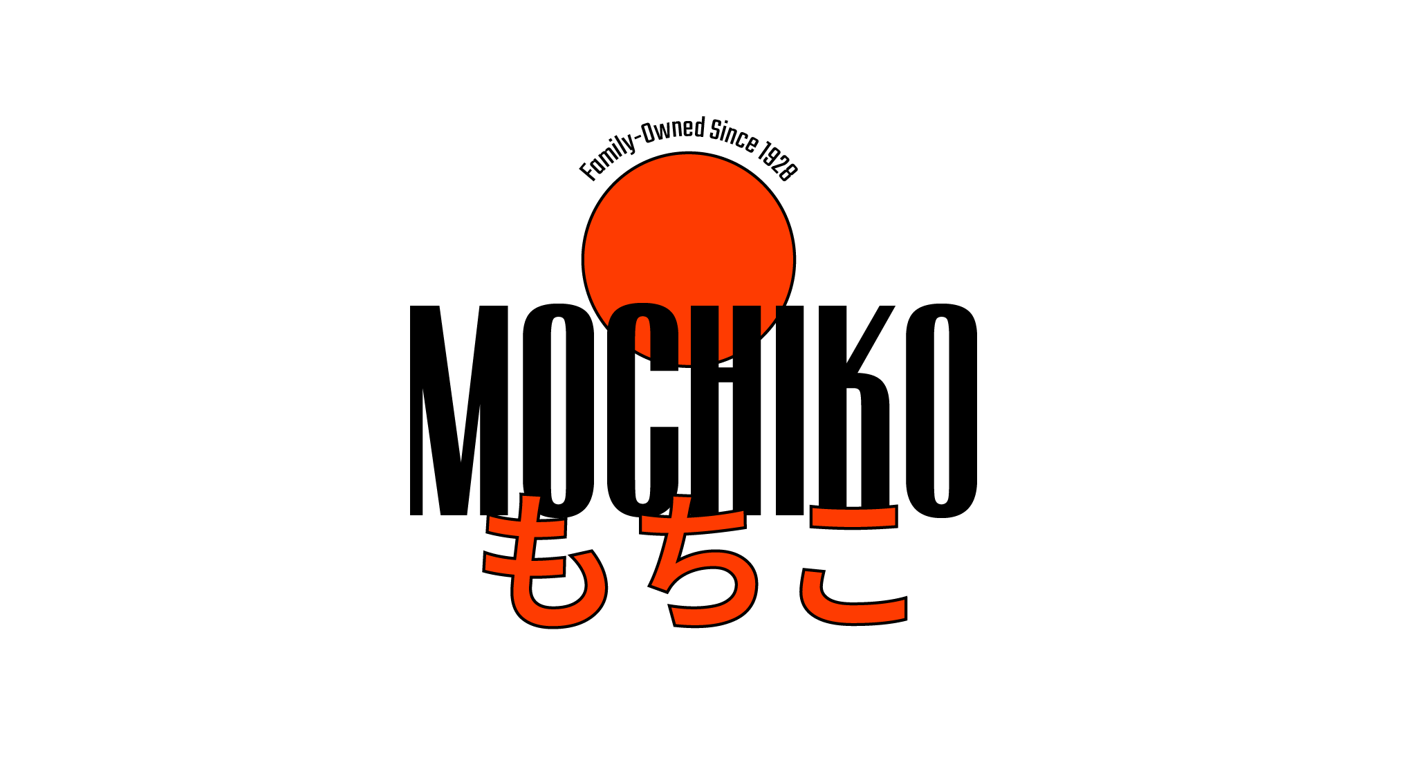
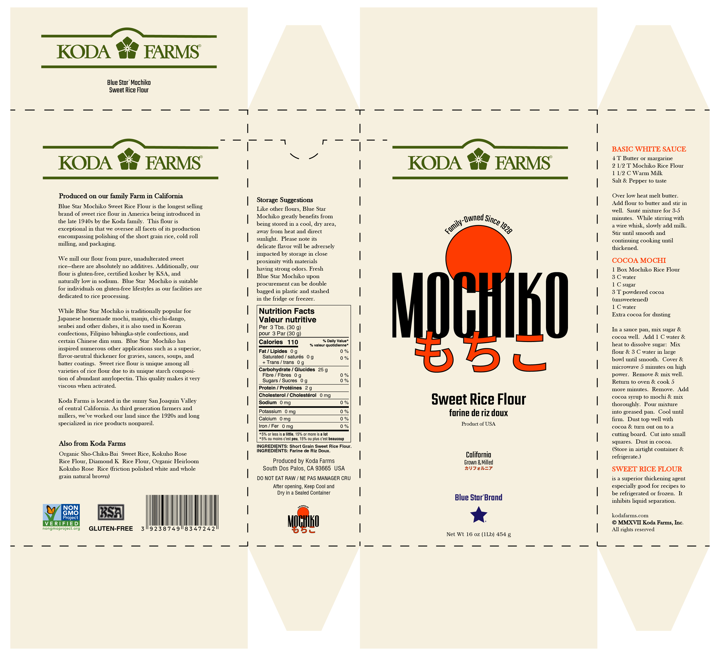
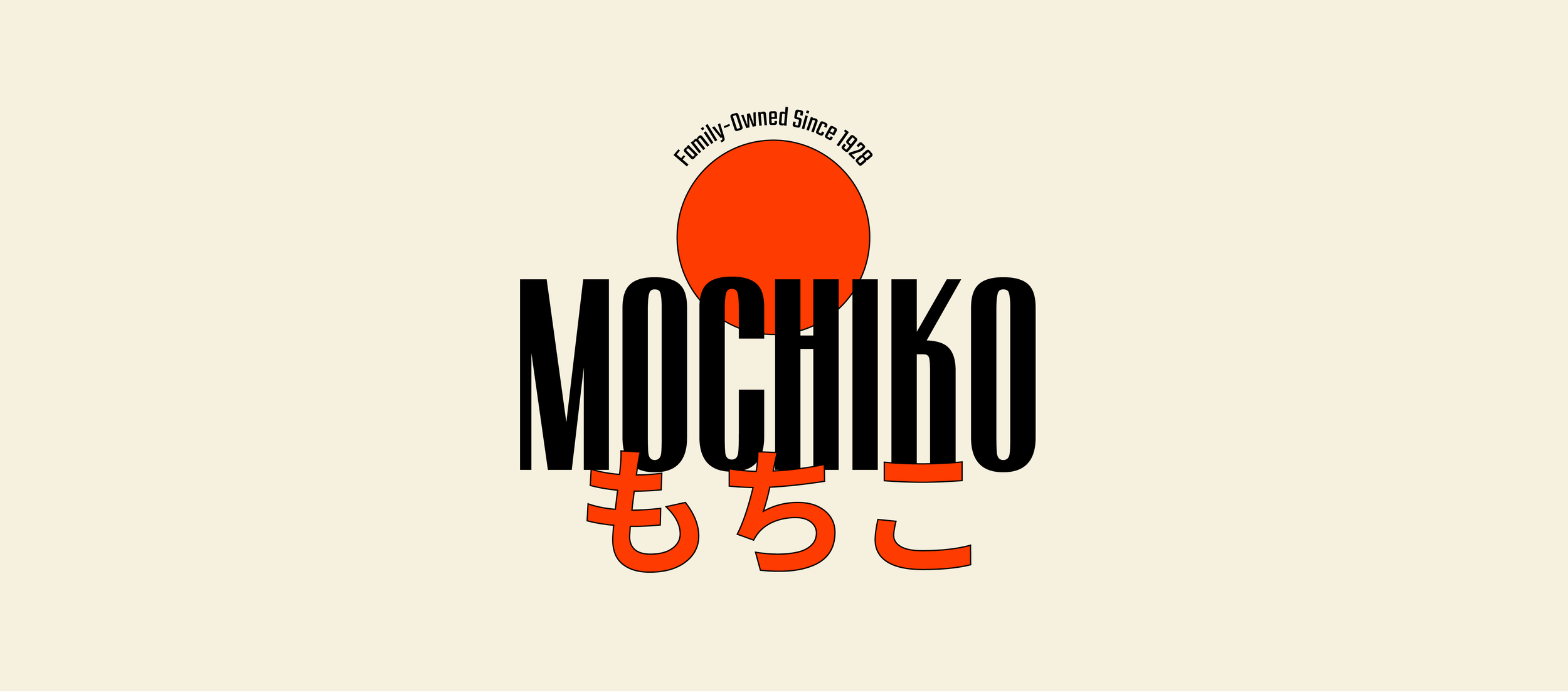
This self-initiated packaging redesign explores a new look for Mochiko Sweet Rice Flour, a pantry staple known for its legacy and versatility in Japanese cooking. The goal was to create a design that feels modern while still honoring its heritage. I tried to make it minimalistic by using only typography and minimal graphics. The red sun nods to the original design and Japanese symbolism of prosperity and warmth. This redesign balances tradition with a modern feel fit for today’s shelves.
PROJECT OVERVIEW
ROLE: Designer
DATE: 2024
SCOPE: Packaging Design, Typography, Layout
DELIVERABLES: Packaging Design